
The Color Wheel as a Map for the Inner World
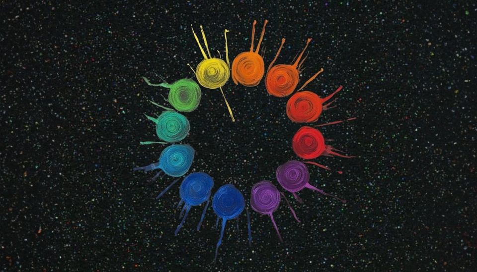
Most people think of the color wheel as something artists use. A diagram in a textbook. A classroom exercise. But if you look at it more closely, it begins to resemble something else entirely:
A map.
Not a map of geography, but a map of emotional weather. The colors that surround us are not passive decoration. They quietly influence how alert we feel, how calm we feel, and how easily our minds can settle.
The color wheel simply helps us understand how those relationships work. Once you see it this way, color becomes less about aesthetics and more about navigation. You might call it visual medicine: the gentle way light and color help guide our internal state.
The Warm and the Cool: Two Emotional Climates
If you divide the color wheel in half, you immediately see two distinct regions. One side feels energetic. The other feels calmer.
The Warm Side
Reds, oranges, and yellows live on the warm side of the spectrum. These colors feel close. Immediate. Alive with energy.
They tend to pull our attention forward and bring energy into a space. This is why warm colors often show up in places meant for gathering, cooking, and conversation. They create a sense of presence.
Emotionally, warm colors often mirror states like:
- excitement
- motivation
- urgency
- passion
- anger
They are not inherently good or bad. They simply activate the system. Sometimes that activation is exactly what we need. A small burst of red in a room can feel like striking a match.
The Cool Side
On the opposite side of the wheel live greens, blues, and violets. These colors tend to feel spacious. Gentle. Expansive. They create the sensation of distance, the way the ocean or a forest canopy seems to stretch endlessly away from us. Our eyes relax when they look at them.
Emotionally, cool colors often echo states like:
- calm
- reflection
- restoration
- quiet focus
- emotional cooling
If warm colors light the fire, cool colors lower the flame. That’s why so many healing environments naturally lean toward blues and greens. These colors create a visual landscape that leaves room for the nervous system to settle.
Opposites as Antidotes
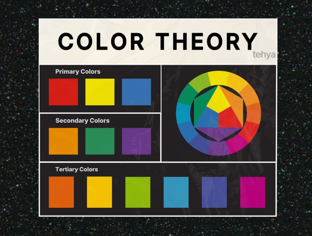
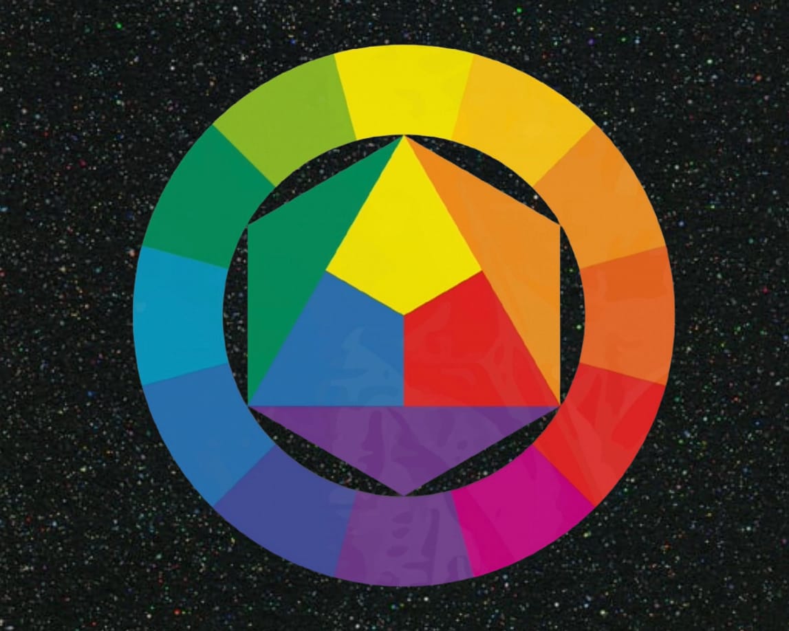
The color wheel also shows something interesting: every color has an opposite. Red sits across from green. Blue sits across from orange. Yellow sits across from violet. These pairings are called complementary colors. But in emotional terms, they can feel like antidotes.
Think about the feeling of standing in a deep green forest after a stressful day. That green doesn’t just look pleasant. It actively softens the intensity you may have been carrying.
It balances the heat.
When emotions feel intense, the colors around us can help guide us back toward center. Nature uses this principle constantly. The red and orange of a sunset rests against the cooling blue of the evening sky. Bright flowers bloom inside vast fields of green. Balance often comes from pairing opposites wisely.
When Colors Move Together
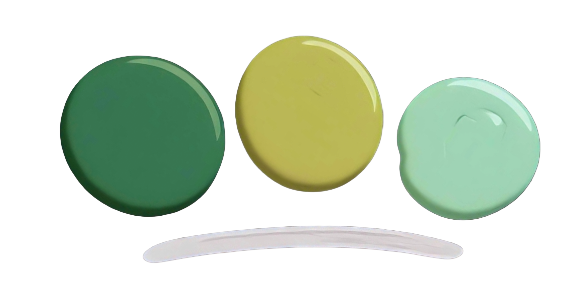
Not all color relationships are about contrast. Some colors sit side by side on the wheel: blue, blue-green, and green. Or yellow, golden orange, and orange. When these colors appear together, something different happens. The eye moves through them easily. There’s no tension or visual conflict. Everything flows.
These combinations create what designers call analogous palettes, but in everyday terms, they simply feel harmonious. You might recognize this feeling in places like:
- the layered greens of a forest
- the shifting blues of ocean water
- the warm gradient of a sunset
Because the colors are closely related, the brain does not have to work as hard to process them. And when the brain relaxes, the nervous system follows. For someone who feels overstimulated, a unified palette can act like a visual deep breath. The eyes find a path. The mind follows.
Living With Color More Intentionally
None of this means we need to redesign our lives around perfect color theory. But it does invite a simple awareness. The colors we surround ourselves with are constantly shaping how our spaces feel.
A room full of sharp contrast and bright stimulation may energize us for a while, but it may also leave the mind restless. A space built from gentle, related colors might feel quieter, easier to inhabit. Even small choices matter.
The color of a journal. The blanket on a chair. The shade of a lamp in the evening. Each one adds a brushstroke to the emotional landscape of a room.
A Small Way to Notice
You might try a simple experiment. Next time you feel overwhelmed, pay attention to the colors around you.
Are they loud or quiet?
Warm or cool?
Clashing or flowing?
Sometimes changing the environment doesn’t require dramatic action. Opening a window toward green trees. Lighting a warm lamp instead of overhead lights. Placing a small plant beside a workspace. These shifts are subtle, but the body often notices before the mind does.
The color wheel may look like a simple diagram. But in practice, it can be used as a guide to how light moves through our lives, and how we might move with it. Color is not just something we see. It is something we live inside of.
For a deeper experience, 🌈Earthbound: A Color-Pop Ritual explores earth-aligned living through color, reflection, and sensory awareness.