Borrowing Color from the Living World
Color As Information
For thousands of years, the human brain evolved inside ecosystems. Forests, shorelines, grasslands, and riverbanks. Our eyes learned to read these places the way a sailor reads the sea. Color became information.
A certain shade of green signaled nearby water. Warm clay tones promised stable ground. Soft grays and blues spoke of open air and vast distances. Because of this long history, our nervous system still responds to these natural color patterns today.
When a space quietly echoes the palette of a healthy landscape, the body often interprets it as a place of safety and restoration. Not because it is fashionable. Because it feels biologically familiar.
Nature Rarely Uses Flat Color
Look closely at any ecosystem and you’ll notice something important: nature almost never uses a single, flat color. Instead, it layers tones together. Moss sits beside bark. Clay rests next to leaf green. Stone fades into misty gray.
These layered palettes create visual depth. And depth matters to the brain. It signals stability, shelter, and living complexity. When our spaces echo these kinds of relationships, they often feel more comfortable to inhabit.
The nervous system relaxes its constant scanning for danger. Our attention widens. Breathing slows. It is the quiet feeling of stepping into a landscape that knows how to hold life.
Two natural palettes that
support emotional balance
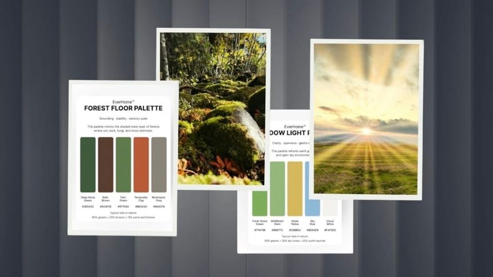
The Forest Floor
Grounding and stability
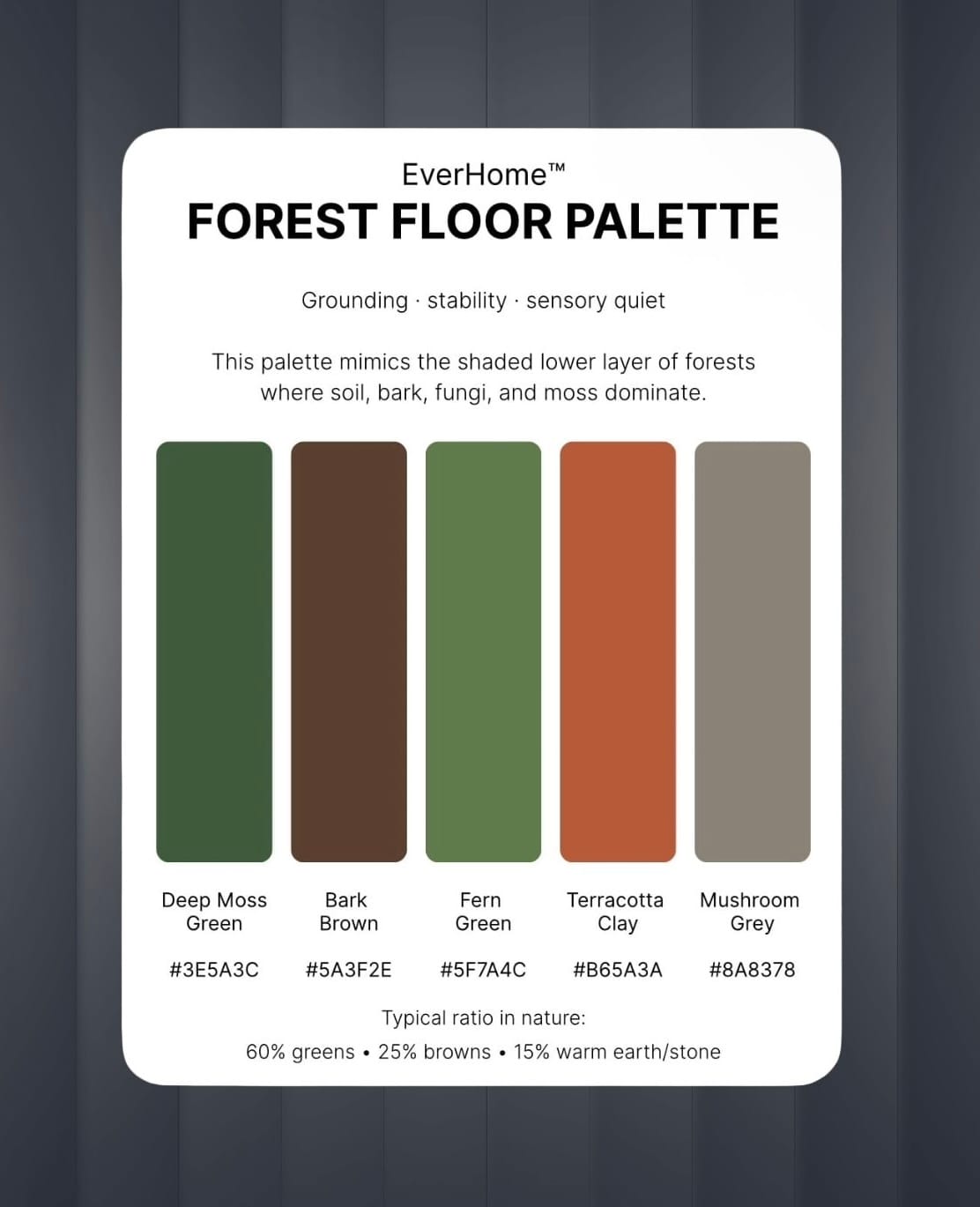
This palette mirrors the colors found beneath a dense canopy. These tones are soft, earthy, and muted. They don’t demand attention. Instead, they settle the eye. Spaces built around these colors often feel anchored and steady, much like standing among old trees whose roots disappear deep into the soil.
From a sensory perspective, darker greens and earthy browns signal fertile environments (places where water, shelter, and plant life are abundant). Historically, such landscapes were essential for survival.
The brain still remembers.
That memory can translate into a subtle sense of security. If your mind feels scattered or overstimulated, the forest palette can act like visual gravity. It gently pulls your attention back down to earth.
The Meadow Light
Clarity and uplift
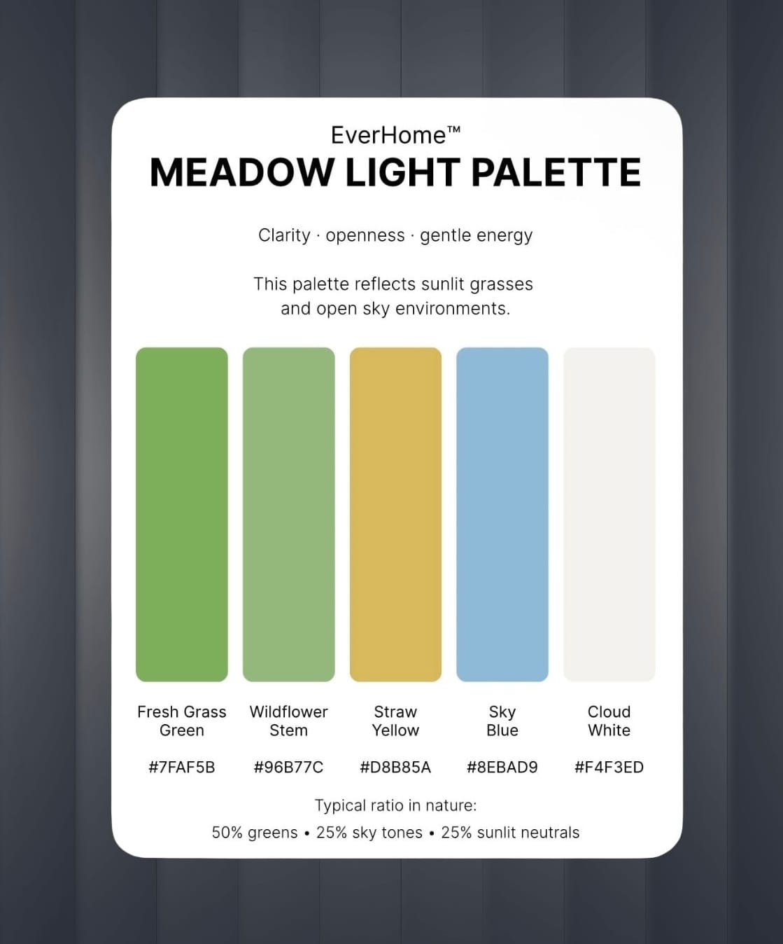
Where forests ground us, open meadows tend to lift the spirit. This palette is built from lighter tones. These colors reflect sunlight rather than absorbing it. They brighten a space and subtly stimulate alertness. Meadow palettes work especially well in rooms where creativity, conversation, or gentle activity happens. Kitchens, studios, reading corners.
The feeling is similar to stepping into an open field after walking through dense woods. The horizon expands. The body feels lighter. Thought moves more freely. It is the visual language of openness.
Why Natural Color Palettes Calm the Mind
When we bring those same color relationships into our homes, journals, and digital spaces, something subtle happens:
the body begins to soften and attention steadies.
We’re reminding the body of landscapes it already understands. Places where life grows. Places where the nervous system knows it can exhale. And sometimes, that quiet reminder is enough to make a room feel more like home.
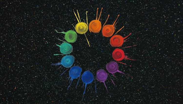
For a deeper experience, 🌈Earthbound: A Color-Pop Ritual explores earth-aligned living through color, reflection, and sensory awareness.